
Hills: Consumer Site Refresh
Redesigned and refreshed the Hills consumer website with new shelter imagery and an updated page layout to better highlight the brand’s mission.
Hills Shelter Donation Page — Before & After

Before: The page used softer, lifestyle-style imagery and straightforward copy that explained the shelter program, but it didn’t fully capture the energy or impact of the initiative. The content leaned text-heavy, with less emphasis on visual storytelling or a clear emotional hook.

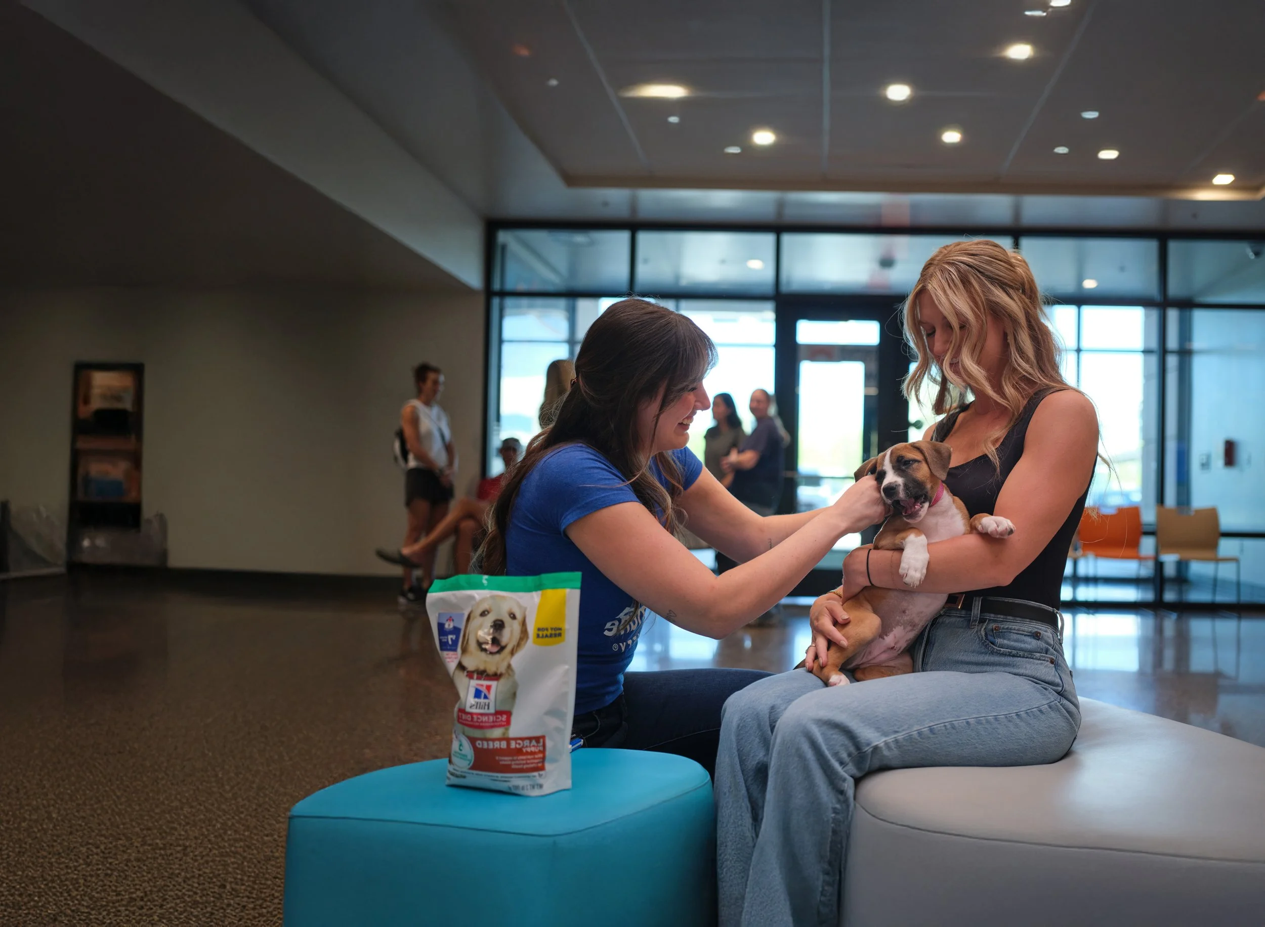
After: The redesign introduced a dynamic hero image featuring a dog and caretaker, paired with a bold headline that reinforces Hills’ ongoing commitment: “Every order. Every time.”

Before: Presented two options — “Buy the bag” and “Make a donation of your own” — but the layout was more segmented, with less storytelling context.

After: Introduced a streamlined flow with a bold testimonial and video, reframing the donation steps as part of a bigger impact story. The structure now feels more cohesive and emotionally engaging.

Before: Inluded multiple smaller modules (“Find a shelter near you” and “Giving hope to shelter pets”), which split focus and added extra navigation.

After: Consolidated into a single, stronger call-to-action: “Donate to shelters directly” plus a locator map. This simplifies the choices while reinforcing Hills’ broader mission and making the path clearer for users.
Website Banner Design

Highlighting the link between science-led nutrition and Hills’ shelter donation program, with a calm, trust-building visual.

Focused on early-life nutrition with playful imagery, reinforcing Hills’ commitment to starting pets strong while supporting shelters.

Direct call-out to Hills’ ongoing donation initiative, pairing authentic shelter photography with a bold brand message
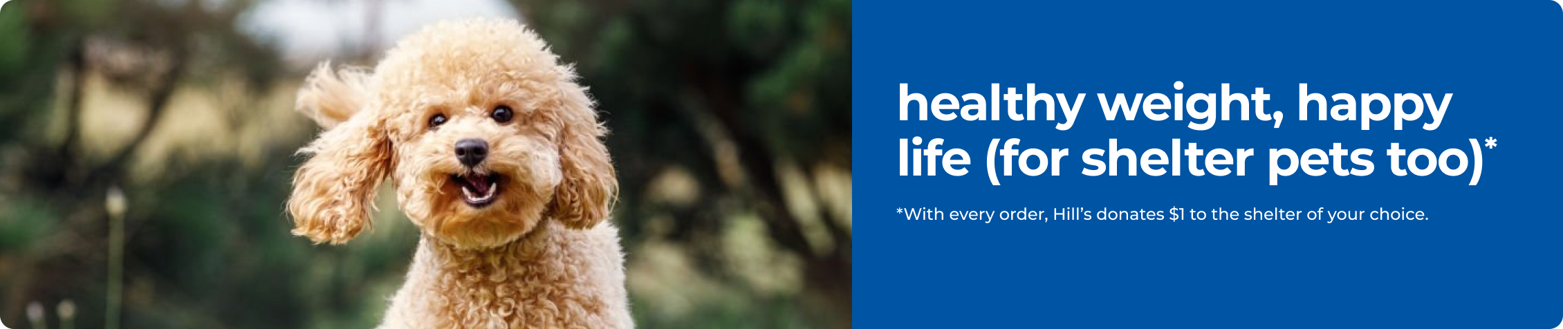
Promoting healthy weight products while tying the message back to shelter support — energetic and approachable.
Product Carousel Panel Concept

Designed promotional panel concepts to live within the product detail page, integrating Hills’ donation message directly into the shopping experience. These explorations balance brand visibility with subtle in-context placement, ensuring the cause is highlighted without disrupting the purchase flow.

Alt 1

Alt 2

Alt 3

Alt 4
Product Page Promotional Panel

Explored ad-style panels within product listing pages to surface Hills’ shelter donation message at the point of purchase, ensuring visibility without disrupting the shopping flow.

Testimonial-driven design adding authenticity through real pet parent voices.

Direct, text-led panel emphasizing the core donation message with clear imagery

Video-based panel option showcasing transparency and impact in action